
Anthem
Packaging Redesign &
Icon System
Challenge
Anthem is a private-label mobile accessories brand sold through PEP stores. The packaging had real problems. Inconsistent layouts, poor visual hierarchy, and low-quality stock icons. No design system in place. No product photography to work with.
The brief: full packaging redesign across multiple SKUs, print-ready for retail rollout, delivered fast.
Approach
Packaging System
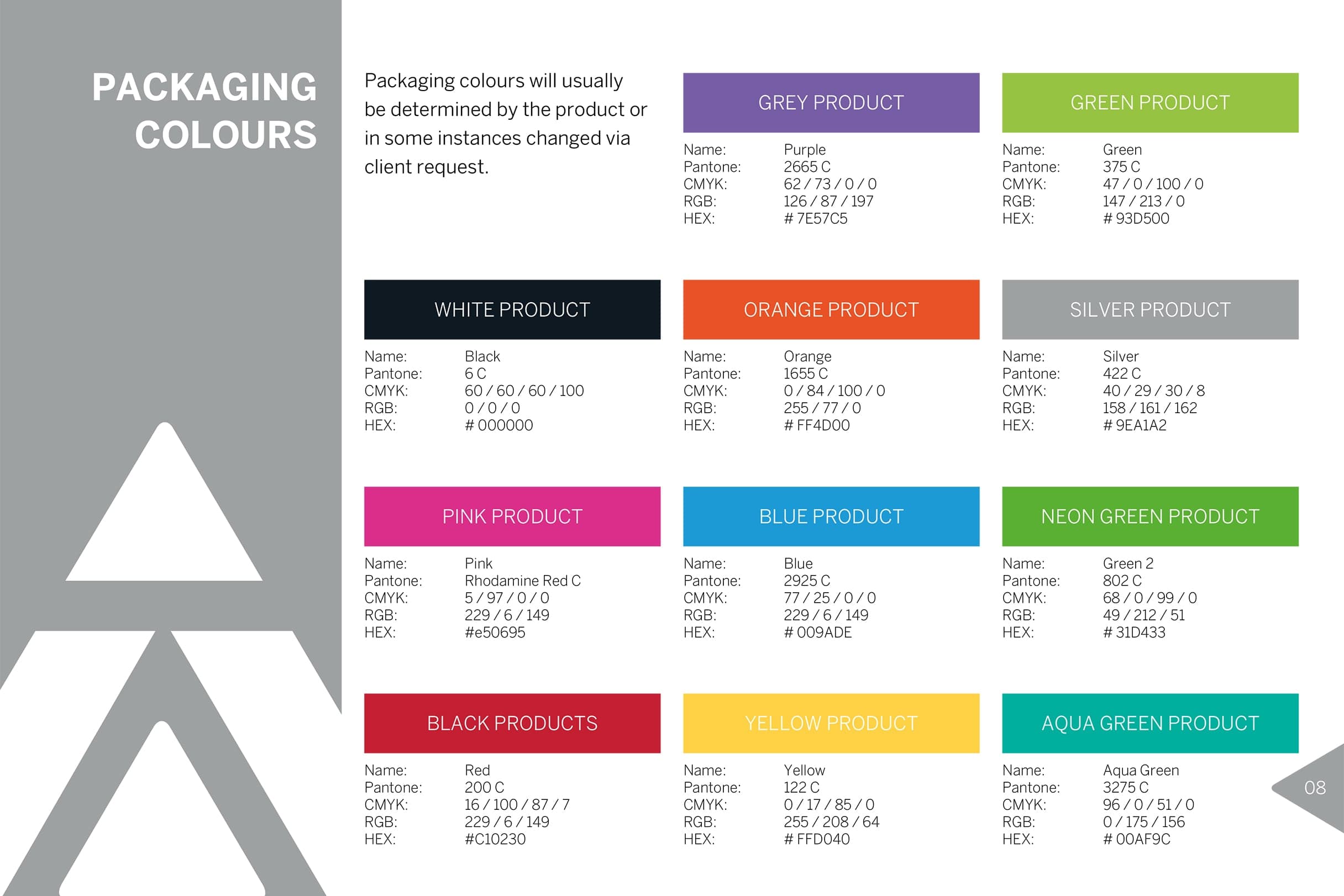
I built a new framework from the ground up. Structured grid. Clear typographic and colour hierarchy. The colour system separates product categories at a glance and keeps the brand reading consistently across the range.
Custom Icons
I designed a full icon family from scratch. Each icon drawn for clarity at small sizes, covering product features like Bluetooth, cable type, and battery life. These replaced the generic stock icons that were dragging the packaging down.
3D Visualisation
No photography budget meant no product shots. I produced detailed 3D packaging mockups in Cinema 4D to visualise and sign off each design before anything went to print.
Production
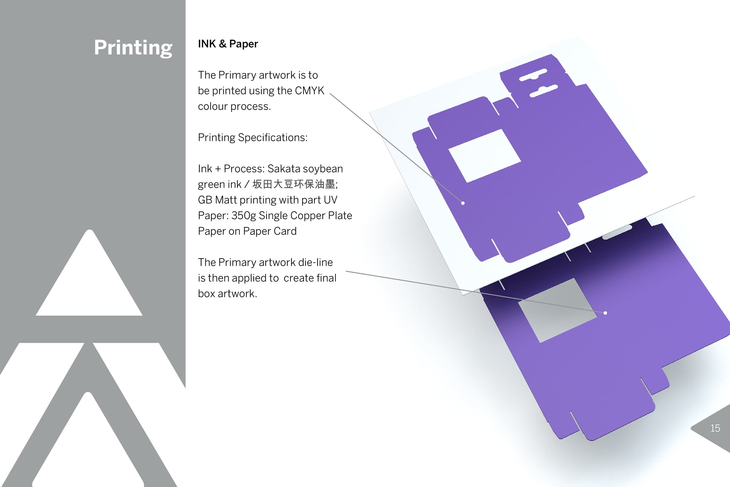
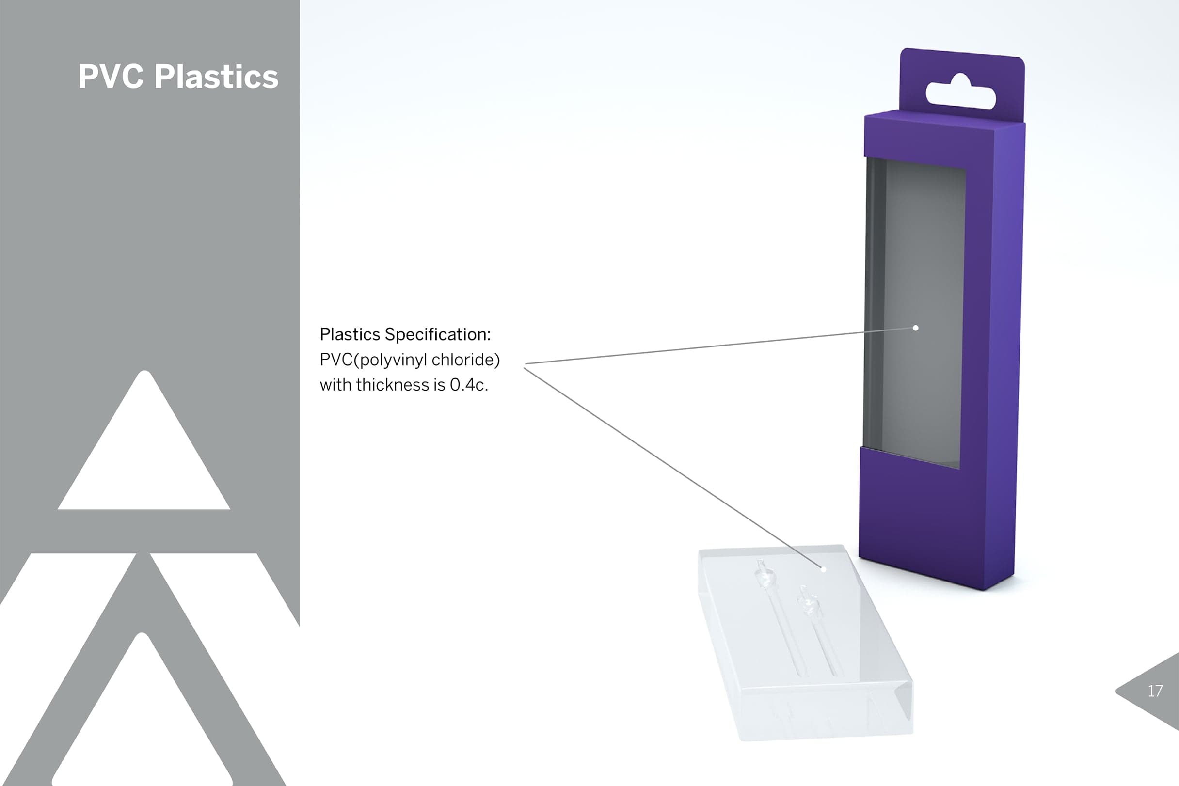
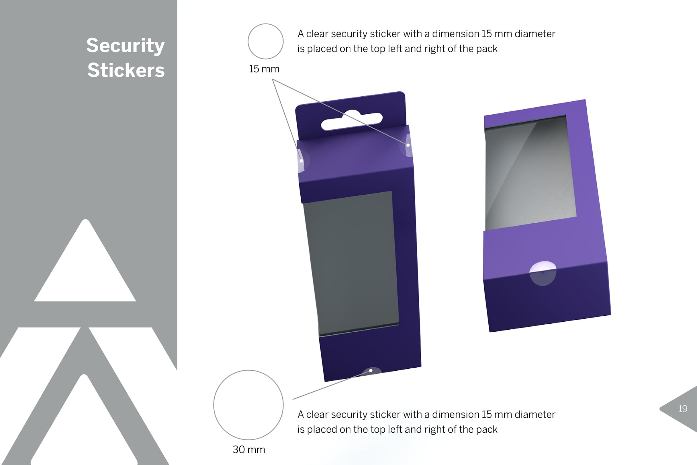
Print-ready artwork for retail display units. Production rollout managed across different packaging formats and sizes over several project phases.
Result
Anthem now presents as a proper brand on shelf. Shoppers can navigate the range quickly. Products read clearly from a distance. The packaging holds its own in a busy retail environment.
The custom icon set gives the range a visual language that travels across every SKU. The 3D mockups meant production could move faster with fewer costly corrections. The system scales. New products slot into the existing framework without starting from scratch.


Services
Packaging SystemsIconography
3D Modelling & Product Renders